
Health, unified
How multiple health sources are combined into one and lessons from the agentic layer.


Oura, Withings, Apple Health and an Apple Watch don't talk to each other. Each has its own app, its own walled garden of numbers. RafeOS puts one view over all of them, makes it available to agents, and curates briefings rather than a wall of figures.
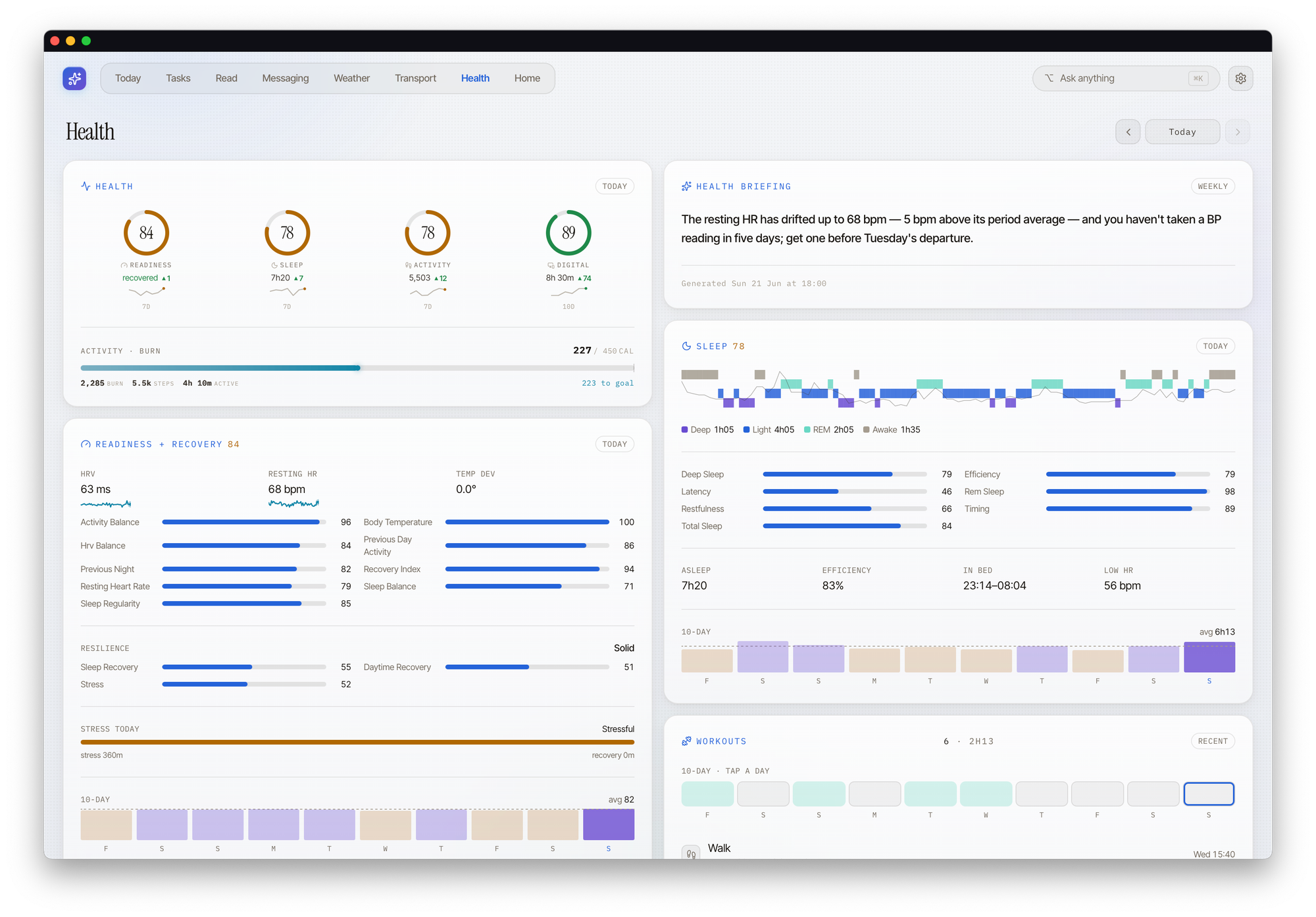
The problem is fragmentation. I wear an Oura ring, which knows about sleep, readiness, heart-rate variability and stress. I stand on a Withings scale, which knows about weight, body composition, vascular age and visceral fat. My blood pressure lives in Apple Health, recorded from a connected cuff. The Apple Watch adds richer exercise data on top. Four or five sources, each with its own app, each a perfectly good set of charts that's entirely unaware of the others. If I want to know whether a bad night's sleep, a creeping resting heart rate and a slightly off blood-pressure reading are three coincidences or one story, no single app can tell me. Each only holds a slice.
One surface over the silos
So RafeOS has a health module, and everything to do with my body comes out of it the same way regardless of where it originated. On the command line that's the health.* verb family (rafeos health summary, rafeos health readiness, rafeos health weight, and so on). I don't have to remember which vendor owns which metric. I ask the system about my health; it knows that readiness comes from Oura, weight from Withings, blood pressure and workouts from Apple Health, and I don't have to.
There are two composed views I reach for most:
health_summaryrolls up the daily signals (readiness, sleep and activity) into one read. This is "how am I doing today, broadly".health_body_metrics_summaryrolls up the slower-moving ones: weight, body composition and the cardiovascular markers. This is "how are the longer trends looking".
Underneath those sit the raw primitives, one per upstream metric, mirroring each vendor's data fairly closely. The composed views answer the obvious question in one call; the primitives are there for when I (or an agent) want to dig into a specific thread. That split, a few opinionated summaries on top with faithful raw data underneath, runs all the way through RafeOS. It earns its keep here especially, because "give me the picture" and "let me investigate this one number" are genuinely different jobs.
Every source, one shape
The thing that made this tractable was deciding, early, that every metric would come out in the same shape no matter where it came from. Oura's API, Withings's API and an Apple Health export behave nothing alike. But by the time anything reaches me, each metric is reduced to the same small structure: the latest value, and a little sparkline of where it's been. Readiness, weight and blood pressure are wildly different things, yet on the surface they read identically. Current figure, recent trend, done.
That consistency is quietly what makes the whole thing usable. Once every metric has the same handle on it, I stop thinking in terms of "the Oura number" and "the Withings number" and start thinking in terms of my numbers. The vendor boundary, an accident of which company made which device, disappears from how I experience the data.
The interpretation is the value
Pulling several services into one screen is integration. Useful, but fairly ordinary; plenty of dashboards aggregate. The bit no single vendor app can do is read across the services and tell me something. Oura can interpret Oura. Withings can interpret Withings. Neither can tell me the three are one story.
The connections it has actually surfaced for me are, I'll admit, mostly common sense once they're in front of you. But I hadn't joined them up myself. That how well I sleep tracks with my blood pressure. More recently, that late-night screen use shows up in the next night's sleep. Seeing the line drawn is what nudges the behaviour.
This is the pattern I keep coming back to across RafeOS: the value is in the things that combine. Any one metric is a number. The cross-service read (does this collection of signals add up to a story, and if so which one) is the part worth noting. Nowhere else puts sleep, weight, activity, readiness, blood pressure and my digital-wellbeing score in a single view. The integration is the cost of entry; the convergence is the point.
The weekly briefing is the real win
I don't sit and run rafeos health summary every morning. The daily "shape of the day" briefing I've written about elsewhere ([#]) folds a sensible line about how I'm doing into the wider narrative: if readiness is low it might suggest an easier day, if things are steady it stays quiet. But the part I'd point to as the genuine win is a separate, weekly health briefing.
It's longer, more considered, and meant to be read rather than glanced at. The shape is fairly fixed. An overall summary, then last week (what happened, with the short-term trends), then the longer view across roughly one to three months (is VO2 max creeping up, where's the body-mass trend going), then correlated factors: the cross-service reads, some obvious, some less so, of the "higher screen minutes track with lower sleep" variety. It looks ahead using the calendar, so if there's a heavier day coming it might suggest banking some rest beforehand. And it finishes on a single nudge, not a list of them. One thing to try this week.
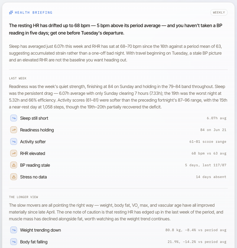
What makes it work is that it's generated in the background. Asking a model to look across this much data and reason about it takes a real moment, anything from a couple of seconds to half a minute, and the health view is the slow one because it reaches across the most sources. Generating it ahead of time means the answer is simply there when I want it, a pre-computed reply to "give me a weekly health brief" waiting rather than spinning.
I'd stress this is still experimental. A lot of what it surfaces is common sense, and dressed up as a weekly read it could easily tip into self-importance. But common sense I'm actually shown, in context, has shifted my behaviour in a way the same fact buried in one of four apps never did.
When it's confidently wrong
An interpretation that's wrong is worse than none at all, and large language models are very good at being wrong with total confidence. Early on, mine welded a blood-pressure reading to an unrelated ENT appointment and produced calm, plausible, nonsensical advice from the two.
There's a recurring shape to it: the model likes to group things together. It will see two event types near each other in the calendar and assume one is preparation for the other, or take two readings and infer a relationship that isn't there.
The fix wasn't a cleverer model. It was the same discipline I use when writing code with these tools: put the lessons in place. The conventions, the rules about what it may and may not connect, live in the equivalent of a system prompt or CLAUDE.md file. It can mention a health signal, it can mention an appointment, it may not causally join the two. Reliability comes not from trusting the model more but from drawing firm lines around where it's allowed to improvise.
Has it changed anything I do?
Honestly, yes. Modestly, and in ways I can point to. I take more measurements, because the system reminds me when one's gone stale. The progress charts, weight and body composition moving over months, turned out to be a real motivator. And when I sat down with my GP about my blood pressure, having cross-source data, I could show, very quickly, what had happened and that things had stabilised. A small thing, but the kind of small thing that's genuinely useful and needs no AI cleverness at all. Just the data, consolidated, in one place.
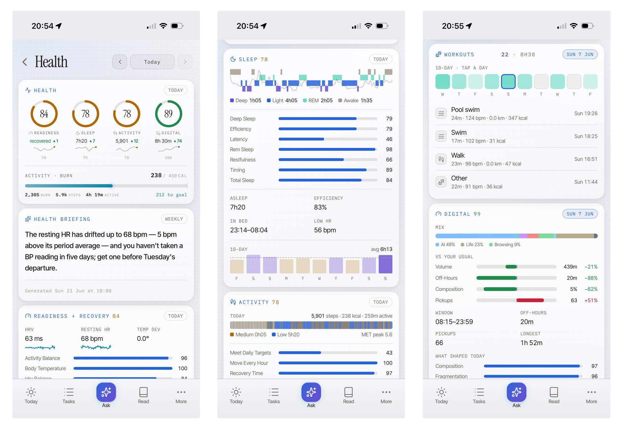
The bit I didn't expect to value is the permission to rest. The nudging cuts both ways: it will suggest some exercise, but it will also say "it's fine, you don't need to today." Being told you've earned a rest day, with the readiness data behind it, is as useful as being told to move. Possibly more, because I'm worse at giving myself that permission than I am at finding reasons to push. A lot of that rest intelligence is really coming from Oura, to be fair, not RafeOS. The system's job is to put it in front of me at the right moment.
Which leads to the tension I haven't resolved: helpful versus nagging. Most of the nudging is deliberately passive. The view shows a measurement's gone stale, or a number hasn't been logged in a while, and leaves it at that. It doesn't interrupt. I'm introducing the more active, notify-me-now kind slowly, because the line between a useful prompt and one more thing buzzing at you is thin, and I'd rather err on the quiet side. I'm also not duplicating notifications other things handle well; Apple Health already nags me about some of this, and a second nag adds nothing. What's helpful and what's nagging is, genuinely, still an open question.
What it deliberately leaves alone
A note on restraint, because it would be easy to keep building here and shouldn't. RafeOS doesn't try to out-analyse Oura on sleep, replace Apple Health's history, or recreate Withings's body-composition trends. Those apps are good at the deep dive, and there's no sense in rebuilding them worse. The job RafeOS does is the one none of them can: the unified glance, the cross-service read, and feeding that read into the briefing so it shows up where I'll actually see it. For anything beyond that, the answer is a link out to the native app. Knowing what not to build is most of the skill.
And the line I won't cross: this is a consolidation-and-nudging tool, not a medical one. It won't be as good as a specialised health assistant, and I'm wary of trusting it for anything genuinely health-critical. It's very good at showing me that I haven't weighed myself in a week, or that two trends seem to move together. It's not the thing I'd ask whether a symptom matters. That's what the GP is for, and the most useful thing the system did on that front was hand me a clean history to take to the GP, not to play one.
On how this was made: the health module is part of RafeOS, which is built collaboratively with AI; this post was also drafted collaboratively with Claude. The figures named in the text are illustrative; the dashboard screenshot is my own data.
New writing by email
Occasional pieces on product, technology and AI — and how they actually play out in practice.


