
The Cockpit
An introduction to Cockpit, the personal app that is the face of RafeOS.


Most of RafeOS doesn't have a face. It's an API, a command-line tool, a set of small functions an agent can call. That's deliberate (the system should be reachable from wherever I happen to be thinking, and most of the time that's a chat window or a terminal, not a screen). But there's one place where I wanted a face: a single surface I can open on my phone or laptop and read in a few seconds. What's on today. How I've slept. Whether the trains are behaving. What's waiting for a reply. In my head I called it the Cockpit, and the name set the brief: instruments, at a glance, trustworthy.
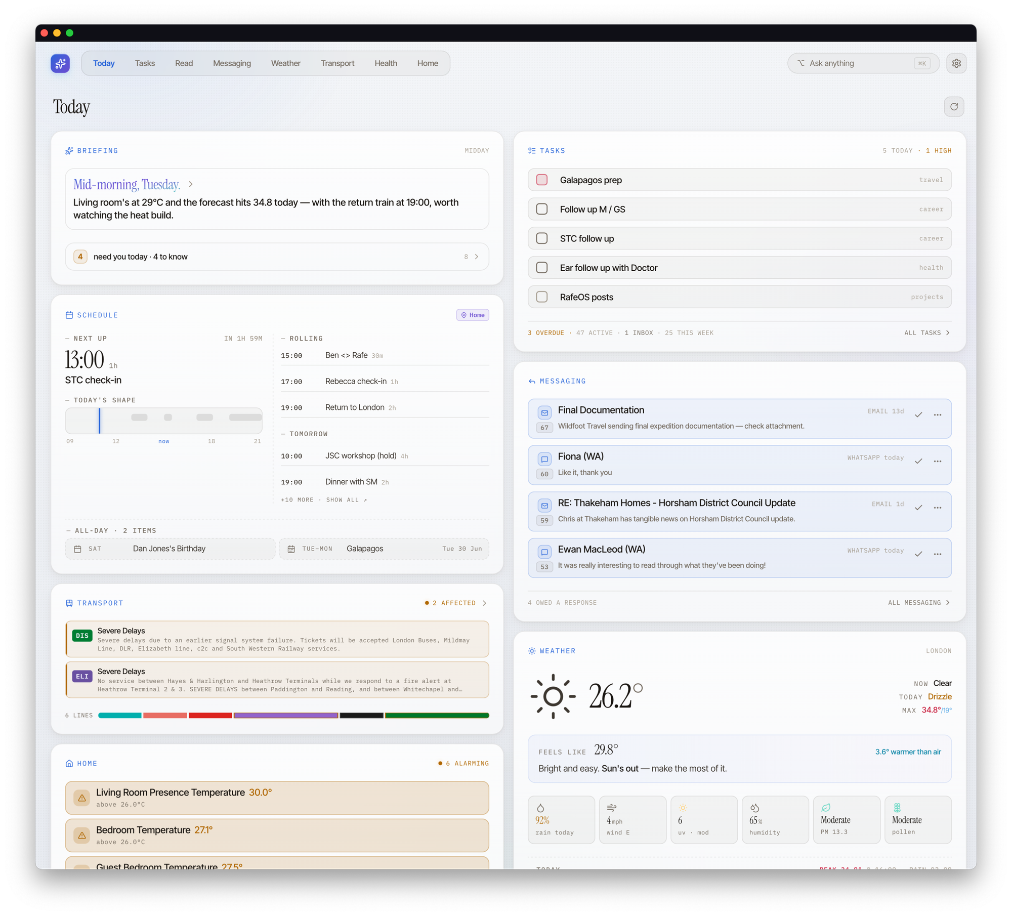
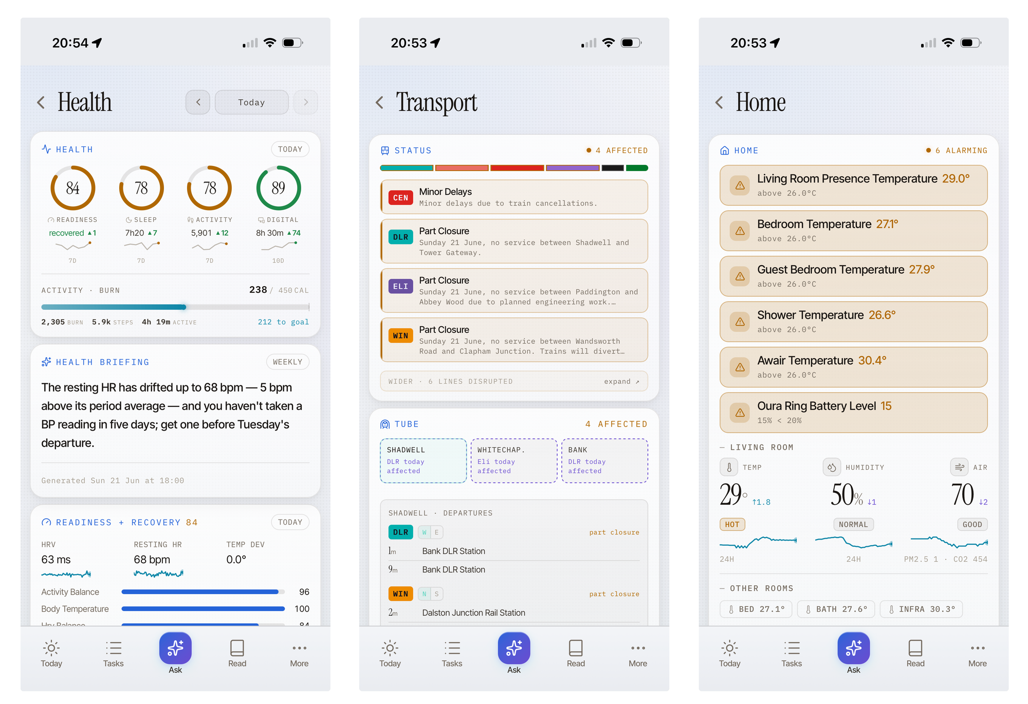
Cockpit in desktop and mobile versions
A recent visit to SXSW London illustrates why this is useful for smarter decision making. I wanted to carry the minimum possible bag (a lot of walking, a long day), so the small decisions mattered: jacket or no jacket, which route in, whether to leave early. One look at the Cockpit answered all three. Weather said intermittent rain, so light jacket. The transport line had a delay on the ground, so I chose to walk (and left time to do so). None of that is clever on its own... but having it in one read, at the moment I was deciding, changed what I put in the bag and how I travelled.
Glance app, not dive
The interesting part wasn't building it; it was deciding what it should not contain, and learning that the better a summary surface presents something, the less I end up opening it.
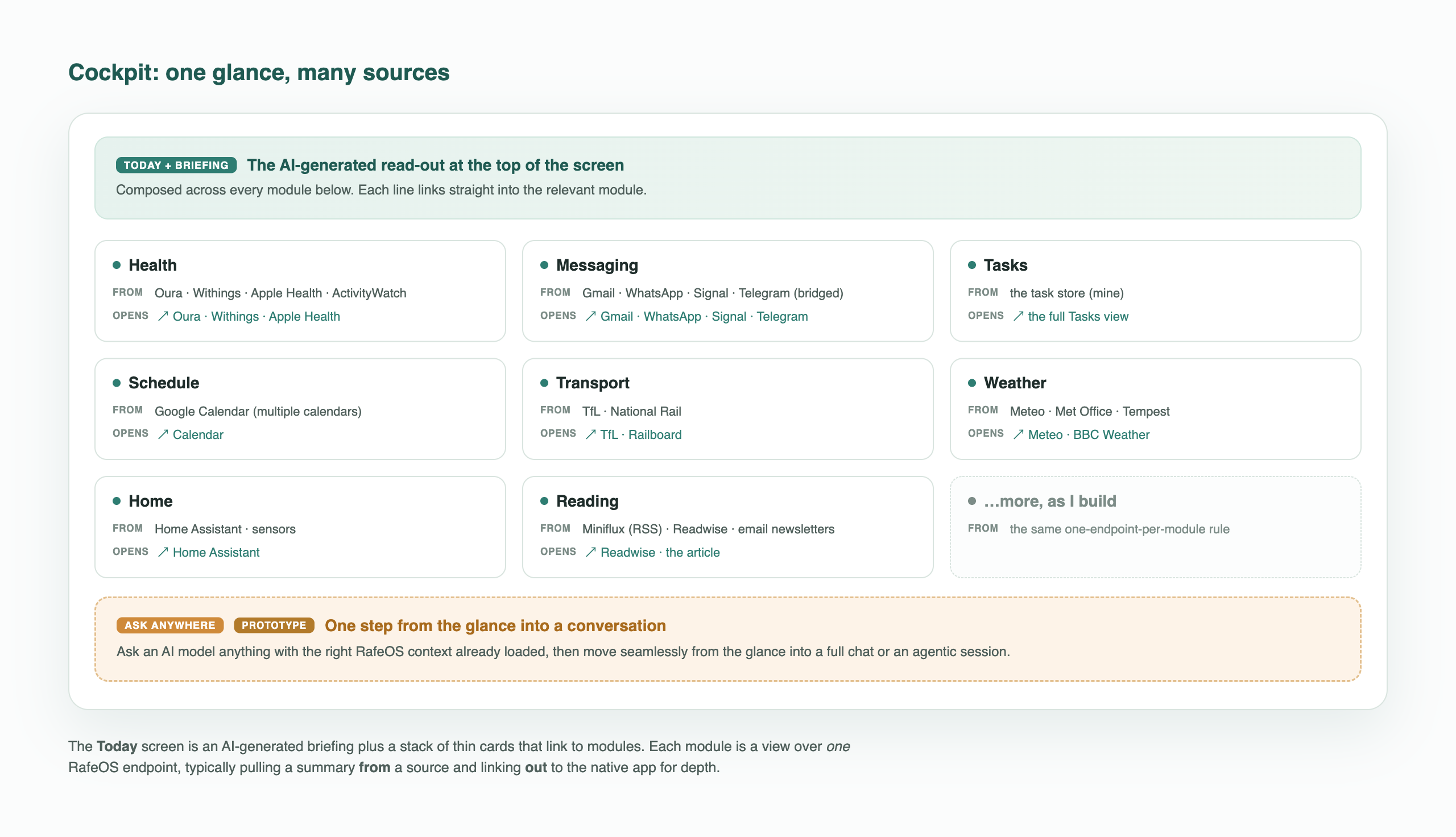
Oura already has excellent sleep analytics. Home Assistant has dashboards I've spent real time on. So, for most modules, the Cockpit's job is narrow on purpose: surface the summary and the key signal, then get out of the way and link out for depth (Tasks and Read are kind of exceptions here, but that's because more complete versions of them live in Cockpit).
So, I think of it as a meta-container app. Each module is a thin window onto something that lives properly elsewhere. The skill is choosing what's worth pulling forward into the glance and what's better left one or two taps away.
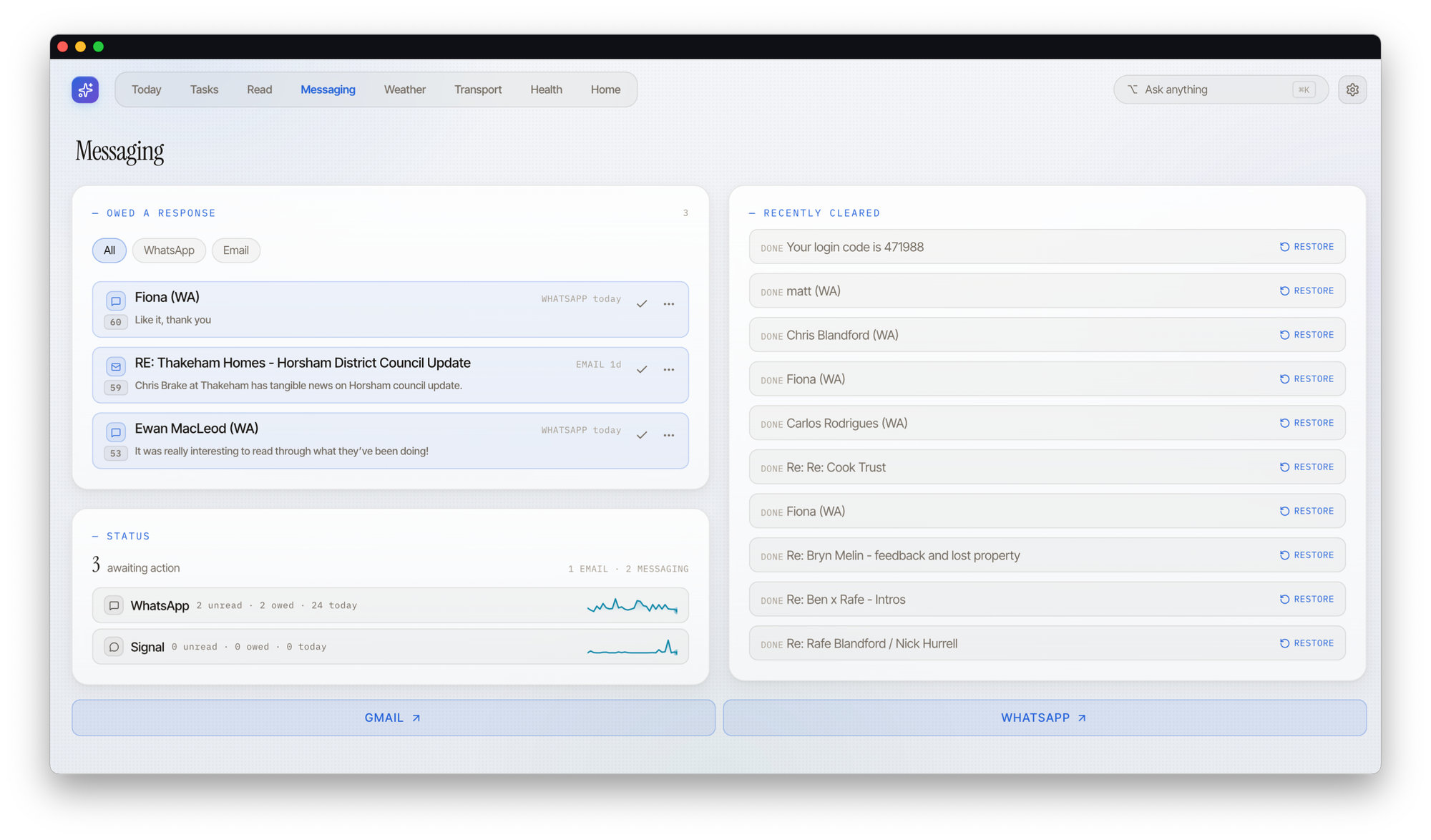
And a second big part of this is using AI (or agents if you prefer) to help with choosing the content or status that is pulled forward. The messaging module unifies and triages incoming comms (and flags things that need a reply), the tasks module is co-owned with agents, and there's time-of-day and context intelligence baked in too.
The thing I actually look at
The stats tell me that the individual modules I use most are tasks, messaging and health, partly because those are the most mature and partly because they drive a lot of daily life activity. But the thing I look at most isn't a specific module, it's the cross-module today screen with its AI-created briefing and summary glance cards.
The daily briefing is a very short summary of what's happening, regenerated four to six times through the day. It synthesises across several channels and tries to make decisions for me rather than just listing things (I'm still tweaking the prompt that generates it). Under it sits the part I'm most pleased with, done deterministically with tools already in place rather than asking a model anything: a status line of things to do today and things to know, each one a deep link into the right RafeOS module if I want the detail. The essential stuff sits at the very top of the screen and I never have to scroll for it.
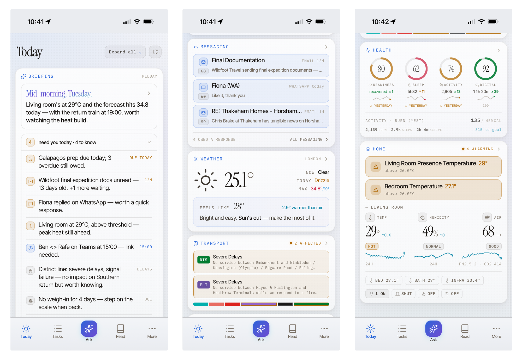
The pattern matters more than the feature. A good briefing is the reason you open the other things less. The weather glance card is a small example. I rarely go into the full weather view now, because the briefing already tells me whether I need a jacket. One line, and I don't look anything up. Better presentation upstream means less navigation downstream, and that turned out to be the single most useful thing the whole surface does.
It's all still experimental. But the principle is set – the meta-layer that filters for you is worth more than any individual module behind it.
Internalise where the value is in combination
So when does something earn a place inside the Cockpit rather than a link out? The rule I settled on: internalise where the value is in the combination, link out where a single native app is already good.
Health is the clearest case. No single app I own combines my Oura readiness with my Withings weight trend and my blood pressure into one read, because no vendor has a reason to. That combination only exists in RafeOS, so it belongs inside the Cockpit and, as a result, is deeper than other modules. The same logic gave me the composite "today" view: briefing + compact cards, none of which is that interesting alone but which together tell me the shape of the day.
Just another client of the same API
Here's where the wider RafeOS architecture pays off, and the part I'm quietly pleased with. The Cockpit isn't a special thing with privileged access to RafeOS. It's just another client of the same API every other surface uses, the same endpoints the command line and the agents call. Each module in the UI is a thin layer over one API endpoint, almost nothing else. The module, generally, doesn't compute anything clever; the cleverness lives in the API, where every surface gets it for free.
Cockpit is a Next.js app (App Router), installable on Mac, iPad and iPhone, served at cockpit.rafeblandford.com. The one engineering detail worth calling out: the TypeScript types the UI is built against are generated from the API's OpenAPI description. The UI literally can't drift from the backend, because the shapes it's allowed to use come from the backend. That's been helpful during the rapid iteration phase and has, I think, helped with the agentic engineering.
Modules that keep themselves fresh
The bit I find most satisfying is underneath the glance entirely. Rather than the Cockpit hammering everything on a fixed timer, each module keeps its own data fresh on a schedule that's aware of context. The Tube status refreshes regularly during rush hour, backs right off on a day I'm out of office, and the weather pulls faster when there's a warning in force. The freshness matches how much I'm likely to care, which saves a lot of pointless polling.
The part that made the composable architecture feel worth the discipline is that the modules consult each other. The transport refresh checks the calendar before deciding how hard to work. A module asking another module a question, to decide how to behave, is exactly the kind of cross-domain joining-up I built the whole thing to get. The Cockpit just gets to display the result.
Real-time only where it earns it
The temptation with a dashboard is to make everything live, streaming, always-current. I didn't. Most cards and modules simply refresh when the app loads or comes back into focus, which is exactly when I'm looking at them and never otherwise. Spending a persistent connection to keep a sleep score "live" would be effort for a number that changes once a day.
Two places earn the streaming: messaging, and chatting with the agent. Both are conversational, both want updates to land as they happen, and for those I use server-sent events rather than full WebSockets. The principle, which I'd apply anywhere: add real-time when something actually needs it, not before, and use the lightest mechanism that does the job.
The module I barely open (and why that's fine)
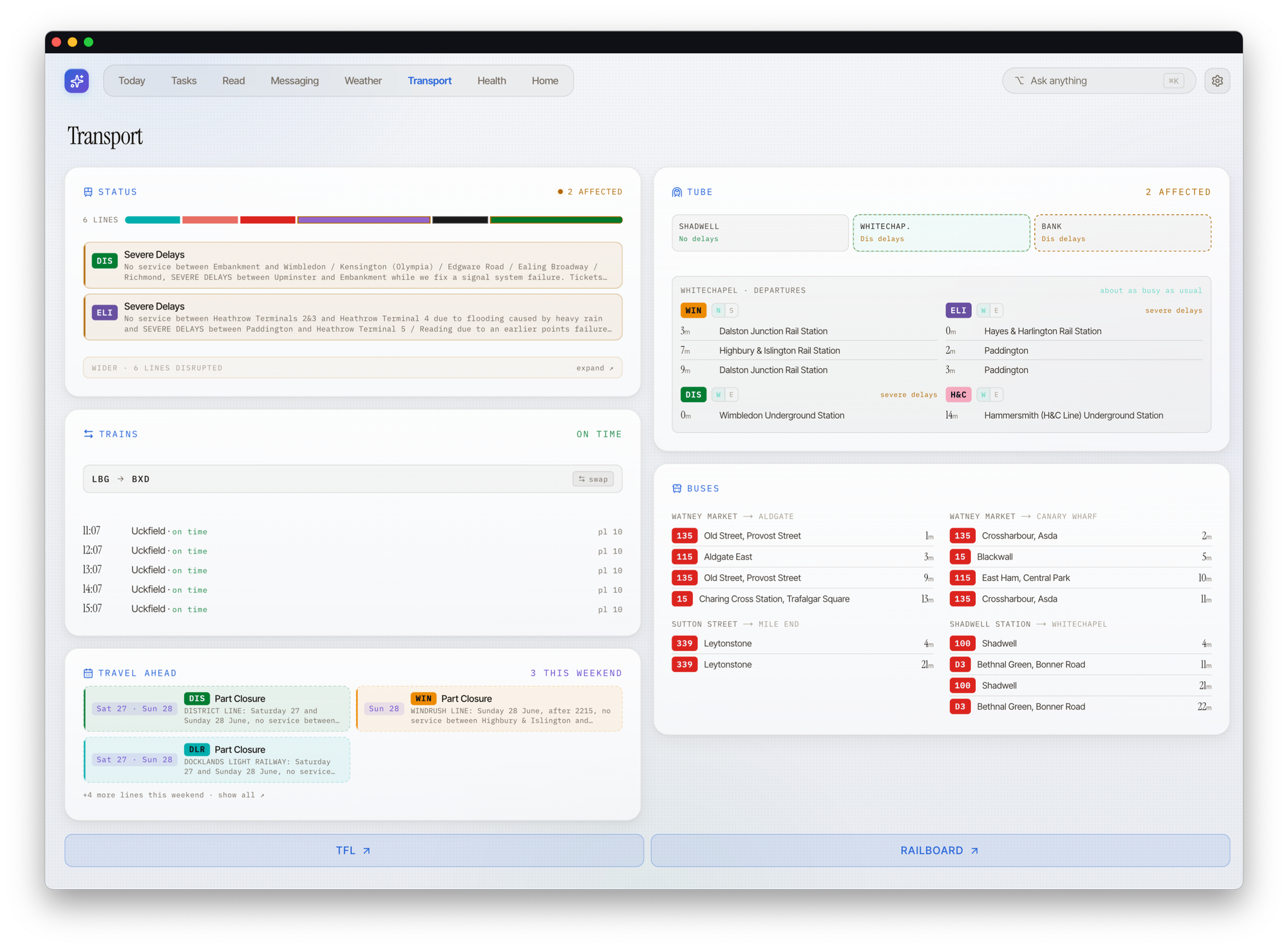
The clearest proof of the "presentation means less navigation" idea is a module I'm genuinely proud of and almost never open: the transport card. I spent real time on it: the Tube lines I actually care about, departures from nearby stations, trains and buses, a personalised London view that lets me time a bus or decide between a fifteen-minute Tube and walking to a different station to dodge a bad line. It's good. And I don't use it as much as I thought I would, because the one thing I'd open it for (a disruption) now floats up to the briefing before I'd ever think to look.
I don't go to transport unless there's a problem, I've been alerted to one, or I've already made the decision. The card didn't fail. The briefing made it redundant for the most common case, which is a strange kind of success.
Home is the module I open least, and that one's honest too. I already have a mature, heavily personalised Home Assistant setup with its own dashboards; I'm not going to out-build that inside a glance. Where the Home module earns its keep is exactly the exception case: telling me when something's out of the ordinary. That's the whole principle in miniature. Do the routine automatically, alert me only on the thing I actually need to act on. The dashboards I built to show state matter less than the system quietly deciding what's worth interrupting me for.
Where it is
Cockpit is useful... and unfinished. The briefing, messaging and tasks are the ones I open daily. Some modules are still placeholders waiting for the right signal to surface, and a couple I built well and now rarely touch. It does the core job (I can read the shape of things in a few seconds and decide whether to dig), and that was the whole point.
In some ways an app surface feels a bit traditional, especially compared to the rest of RafeOS, but there are some things I want to push. The surface I'm most curious about next isn't a phone or a laptop at all. I like the idea of e-ink displays: something to glance at in passing, the briefing or a health trend sitting there without me reaching for a device. A dashboard you don't have to open is the logical end of everything above.
From a glance to a conversation
Aside from e-ink, the other thing I'm prototyping, almost pushing in an opposite direction, is a more dynamic link into an AI harness to make a query or have a conversation. Right now the Cockpit is (mostly) read-only: it shows me the shape of things and then links out for depth and action. The bit I keep wanting is to ask from inside the health card and say “why's my readiness low this week?”, or at a message and say “draft a reply”... and then I want to see how much of this could be delegated or automatic.
So I'm testing an “ask anywhere” affordance: an AI query with the right context already loaded, and a seamless step from the glance into one-shot response, a quick conversation, or a full agentic job (I need to work out the best place for these to happen; I suspect, like the messaging use cases they are different paths). It's early, with experimental wiring, but the idea is to continue to iterate the agentic layer and move from smarter decisions to smarter actions.
On how this was made: Cockpit and RafeOS are built collaboratively with AI, and so was this post. Drafted with Claude, edited, and, in this case, written mostly by me.
New writing by email
Occasional pieces on product, technology and AI — and how they actually play out in practice.


